

- 1952 June
- Established as Akita City School of Arts and Crafts (2 year terms).
- 1975 April
- Name changed to Akita City Vocational School of Arts and Crafts (regular courses: 3 years, advanced Courses: 1 year).
- 1988 April
- Advanced courses renamed “Specialized Courses” and term lengths changed to 2 years.
- 1995 April
- Akita Municipal Junior College of Arts and Crafts established. (First president: Hideo Ishihara)
(With the establishment of Akita Municipal Junior College of Arts and Crafts, Akita City Vocational School of Arts and Crafts becomes a high school attached to Akita Municipal Junior College of Arts and Crafts. Specialized courses are discontinued, leaving only advanced courses.) - 1996 April
- College Extension Center, “Atelier Momosada”, opened.
- 1997 April
- Special courses (1 year) established.
- 2001 April
- Yoshimi Ishikawa appointed as the second president.
- 2007 April
- Toyojiro Hida appointed as the third president.
- 2010 October
- Expert Committee on Restructuring Akita Municipal Junior College of Arts and Crafts into Four-Year University established (Akita City).
- 2011 April
- Four-Year University Establishment Preparation Committee established (Akita City).
- 2012 November
- Establishment of Akita University of Art approved (Ministry of Education, Culture, Sports, Science and Technology).
- 2013 March
- Establishment of Public University Corporation Akita University of Art approved (Akita Prefecture)
- 2013 April
- Public University Corporation Akita University of Art established.
Akita University of Art opened.
Toyojiro Hida appointed as the first president
About our school logo
The school logo of Akita University of Art represents one of our basic philosophies, “Creating and challenges new art fields”, expressed by an unconstrained design with a dynamic and continuous feel that is not bound by typical university symbol designs.
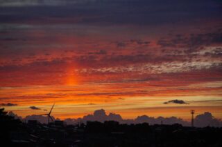
The logo expresses green mountains and the Sea of Japan beautifully colored by the setting sun, which can be viewed from Akita City, using two lines in light green and pink. The lines, expressing the mountains and waves respectively, become unified while intersecting with one another like a braided cord. This expresses the basic philosophy of the university that students transversely study art across multiple genres and that the university and its students become connected with the community and create, cooperatively develop and transmit new values to the world.
Each line also represents the first letter of each word of the name of the university, “Akita University of Art”. The shape, which also looks like four mountain peaks, represents the four basic philosophies of Akita University of Art, while being reminiscent of the triangular shape often used for university buildings (atrium buildings, symbol towers, etc.) and the triangular roof of the workshop buildings (former national rice storehouses).
The two colors used are close to being complementary colors on the color wheel, and have the effect of accentuating the colors of one another and increasing their visibility and appeal.
(School logo design: Yuka Otani, Visual Arts Courses associate professor)